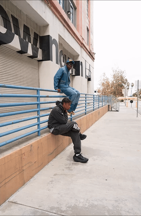
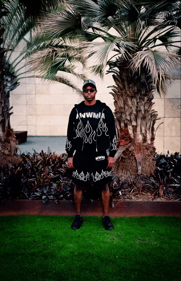
Campaign — Zebb Powell
Athlete Content


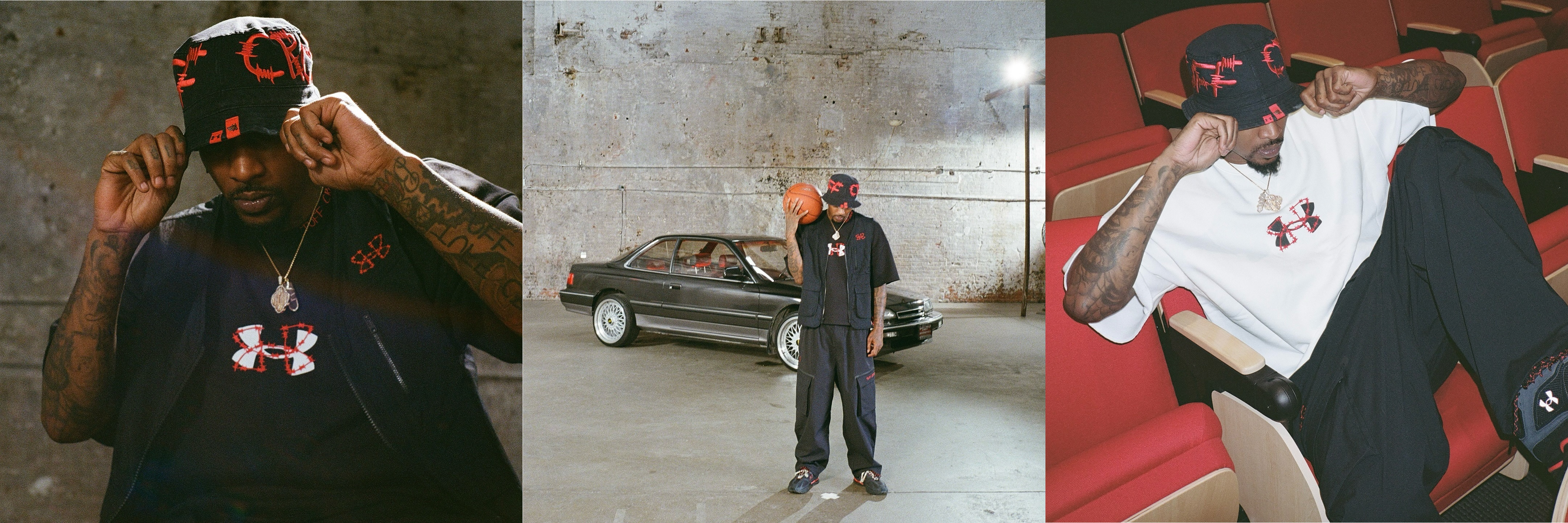
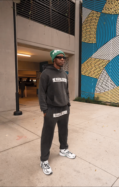
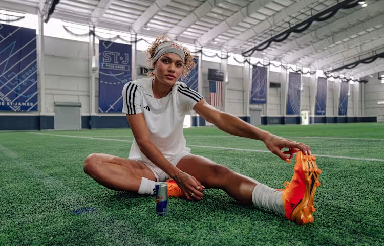
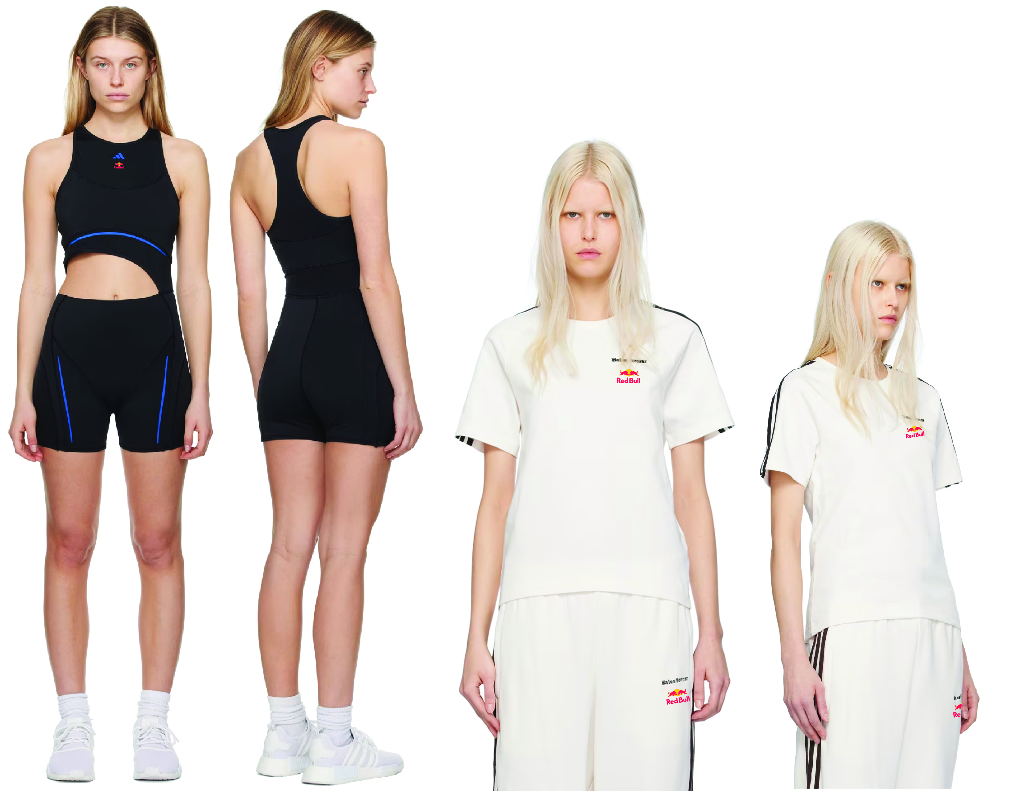
Campaign — Trinity Rodman
Athlete Content
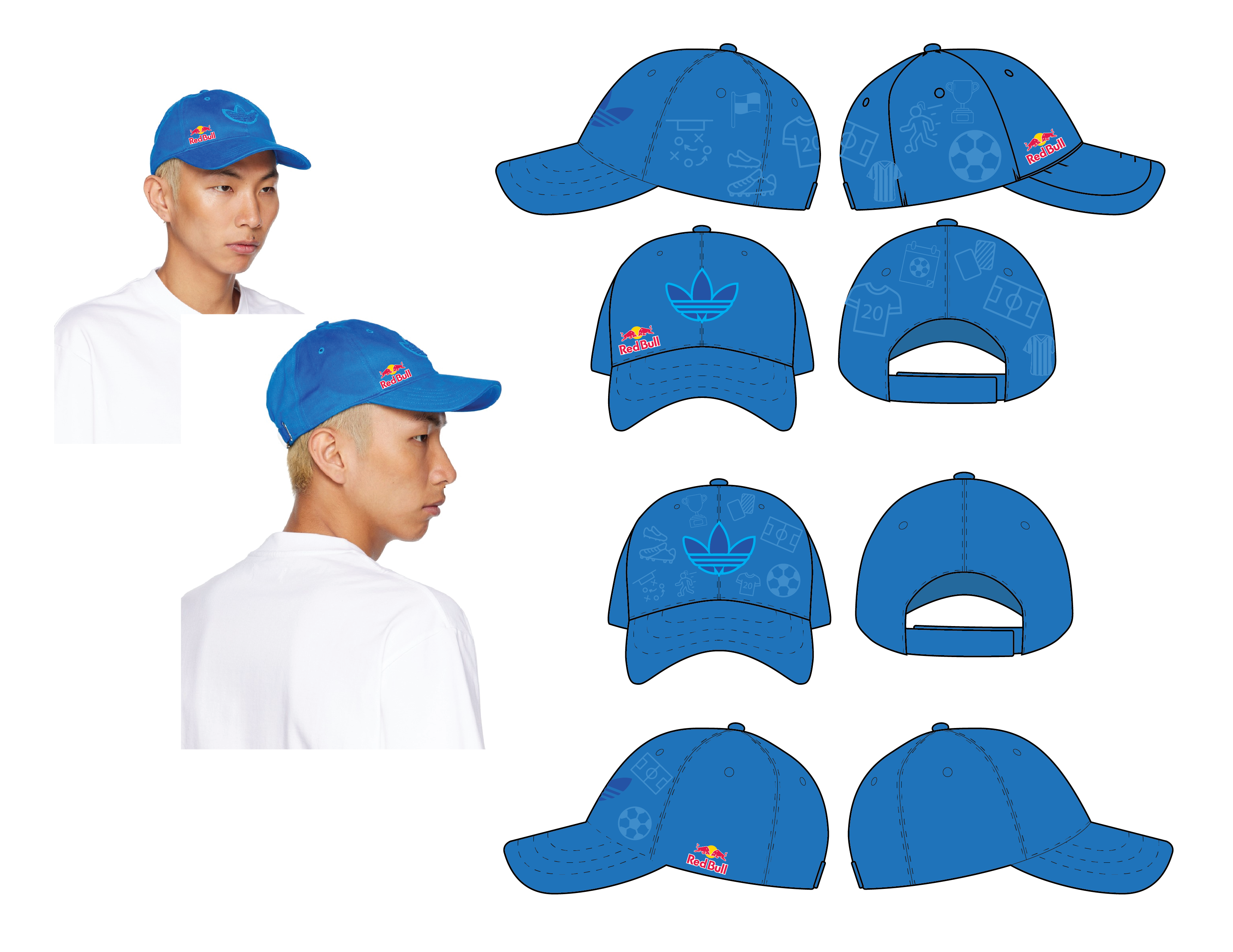
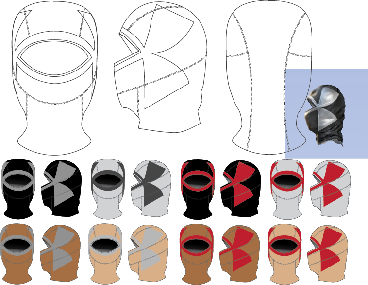
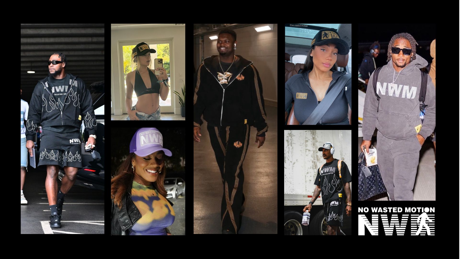
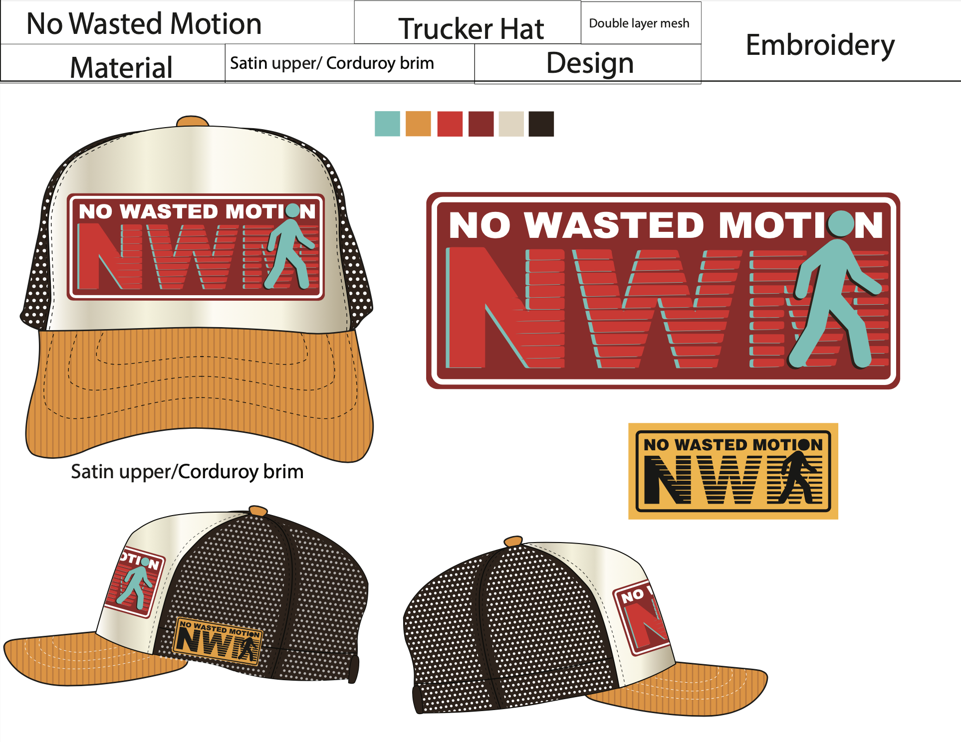
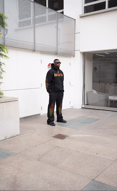
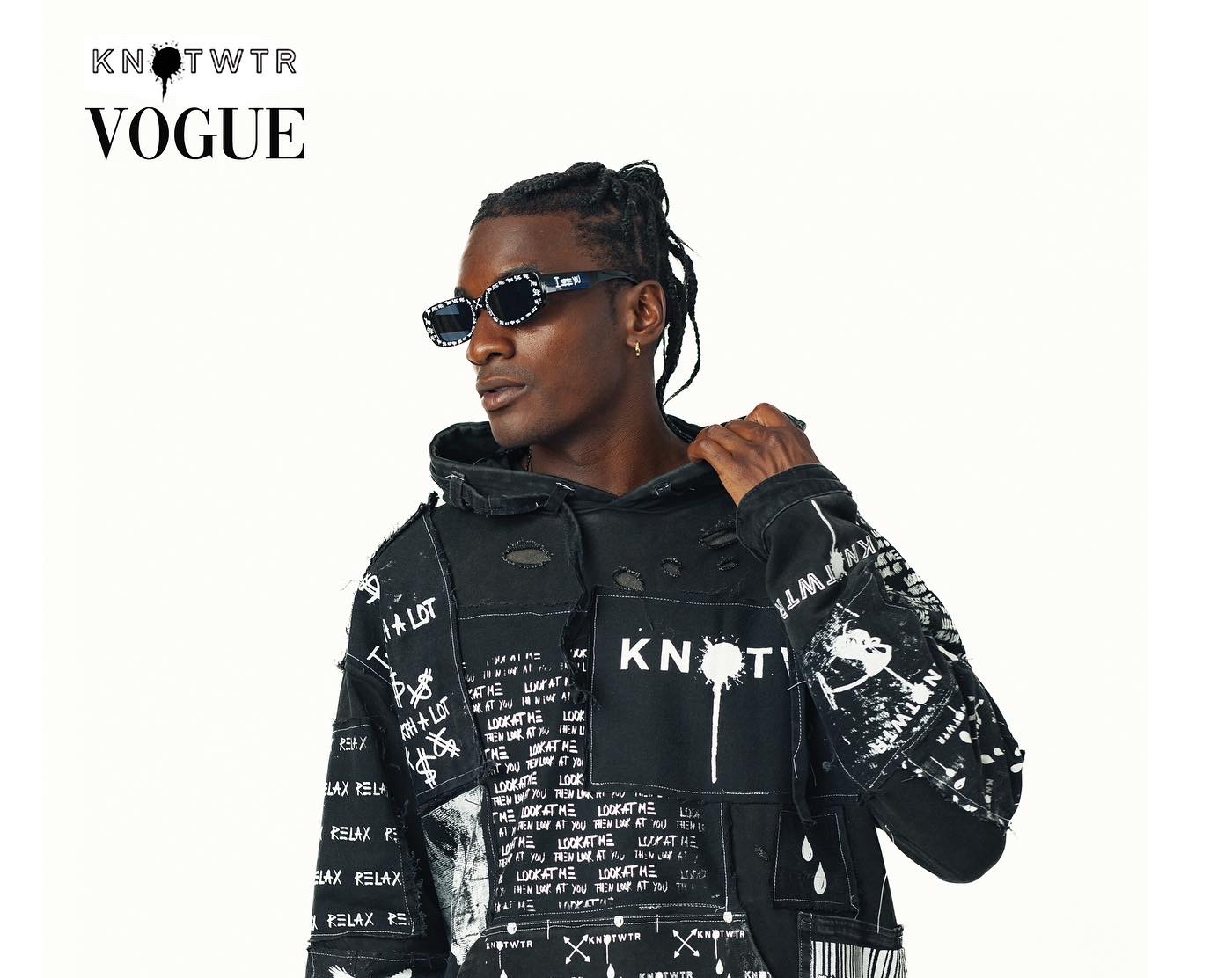
Collection — Headwear / MSC
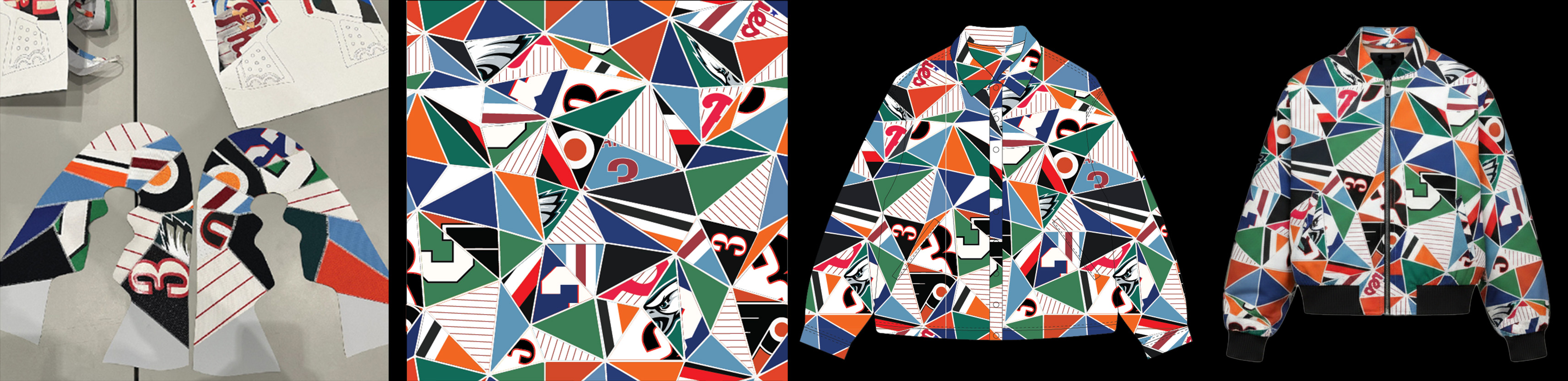
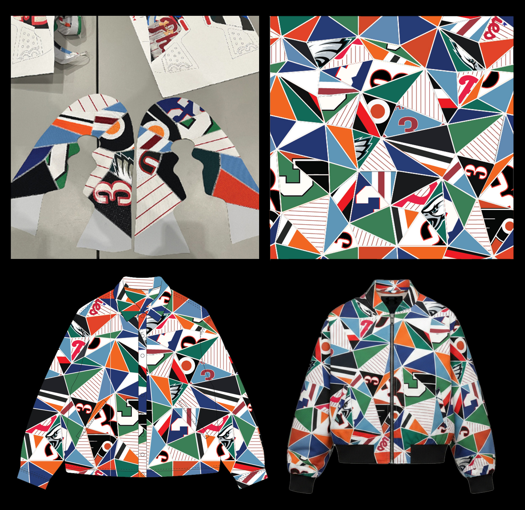
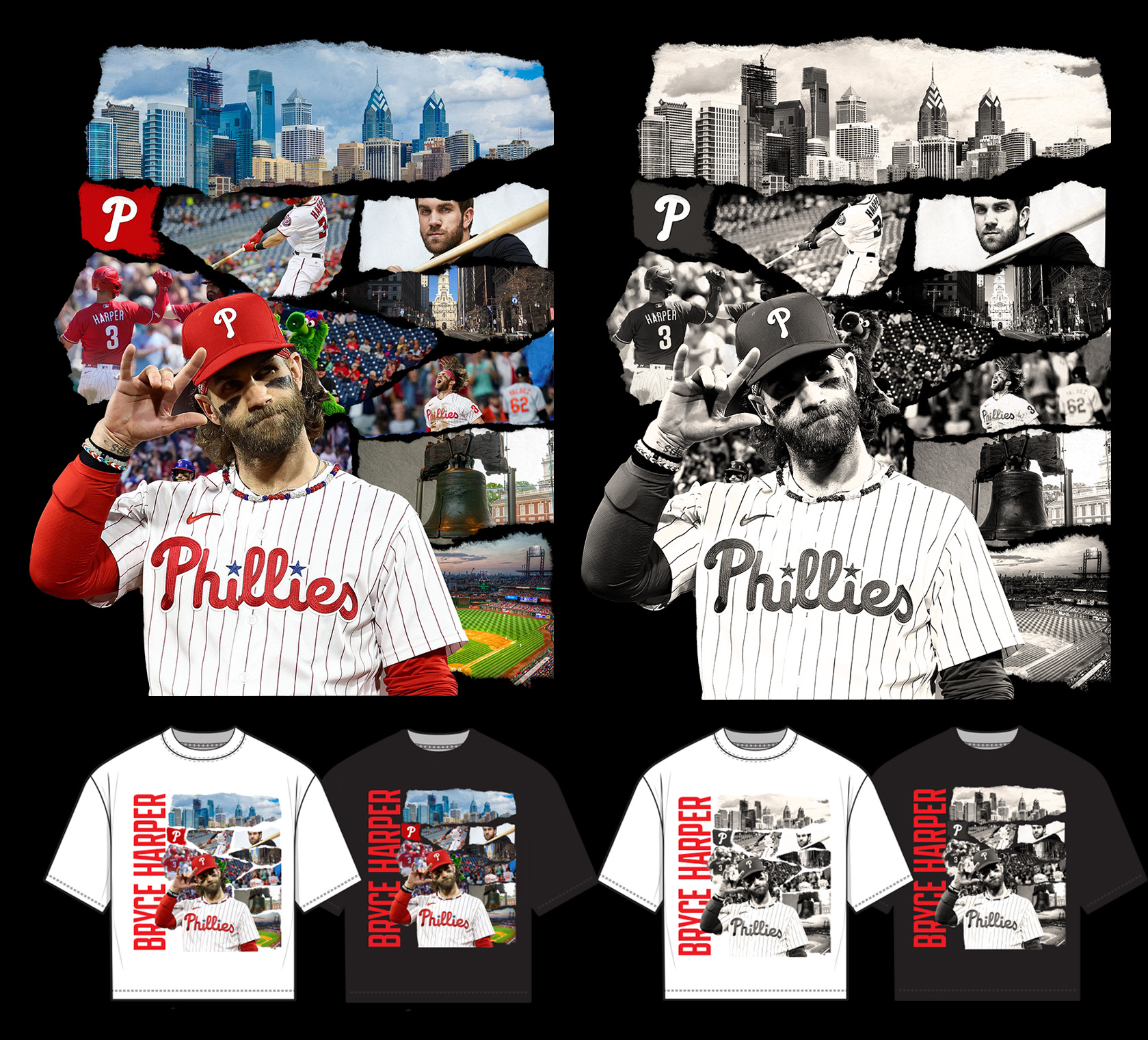
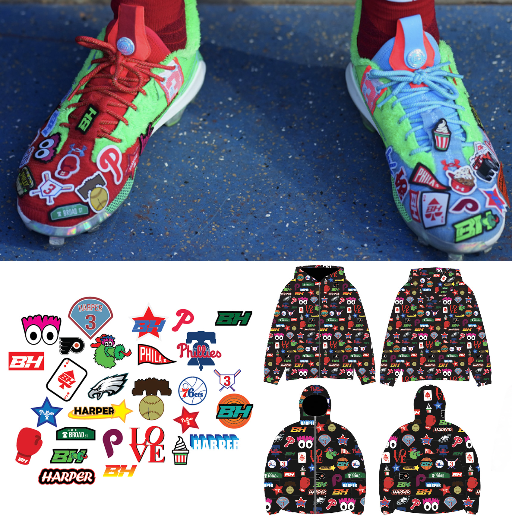
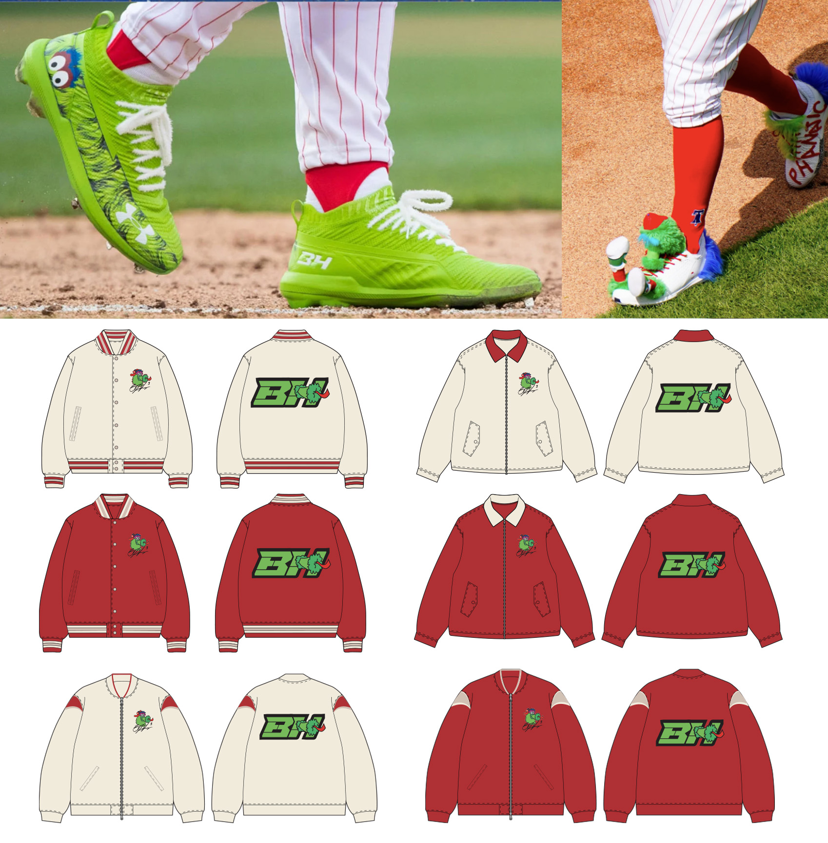
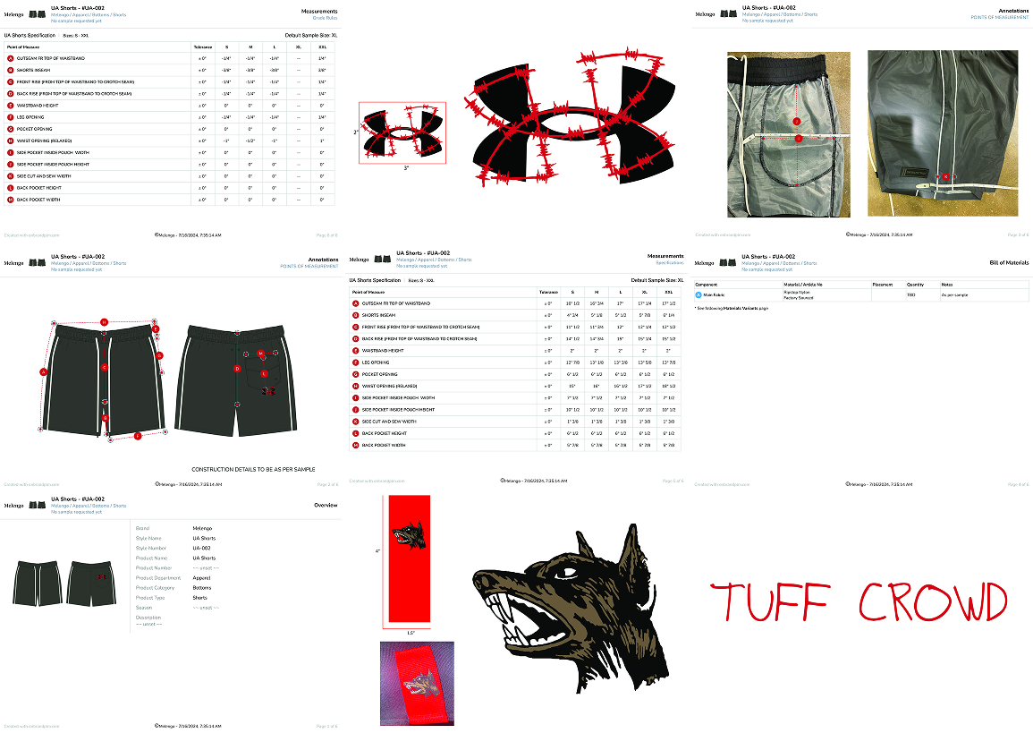
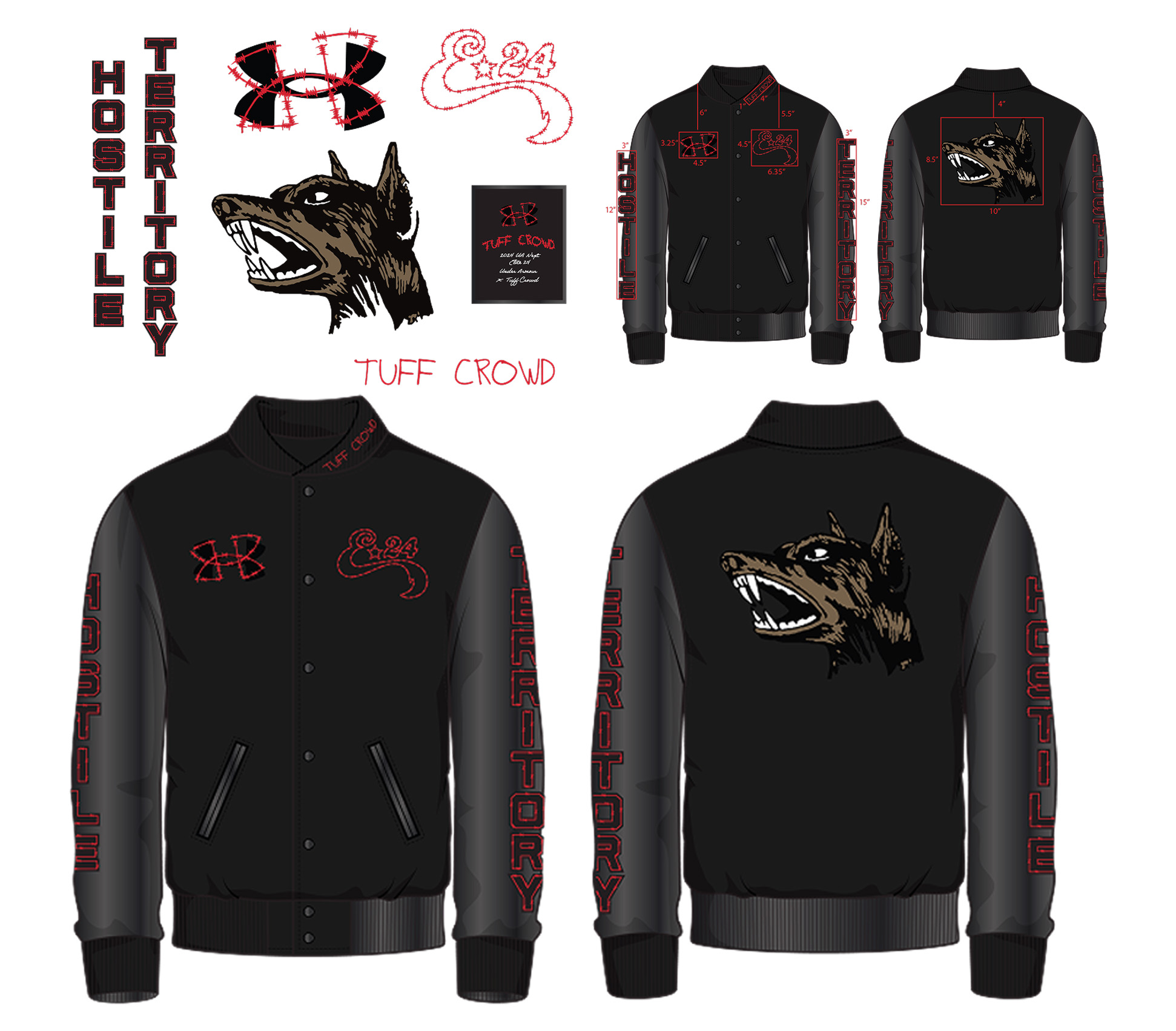
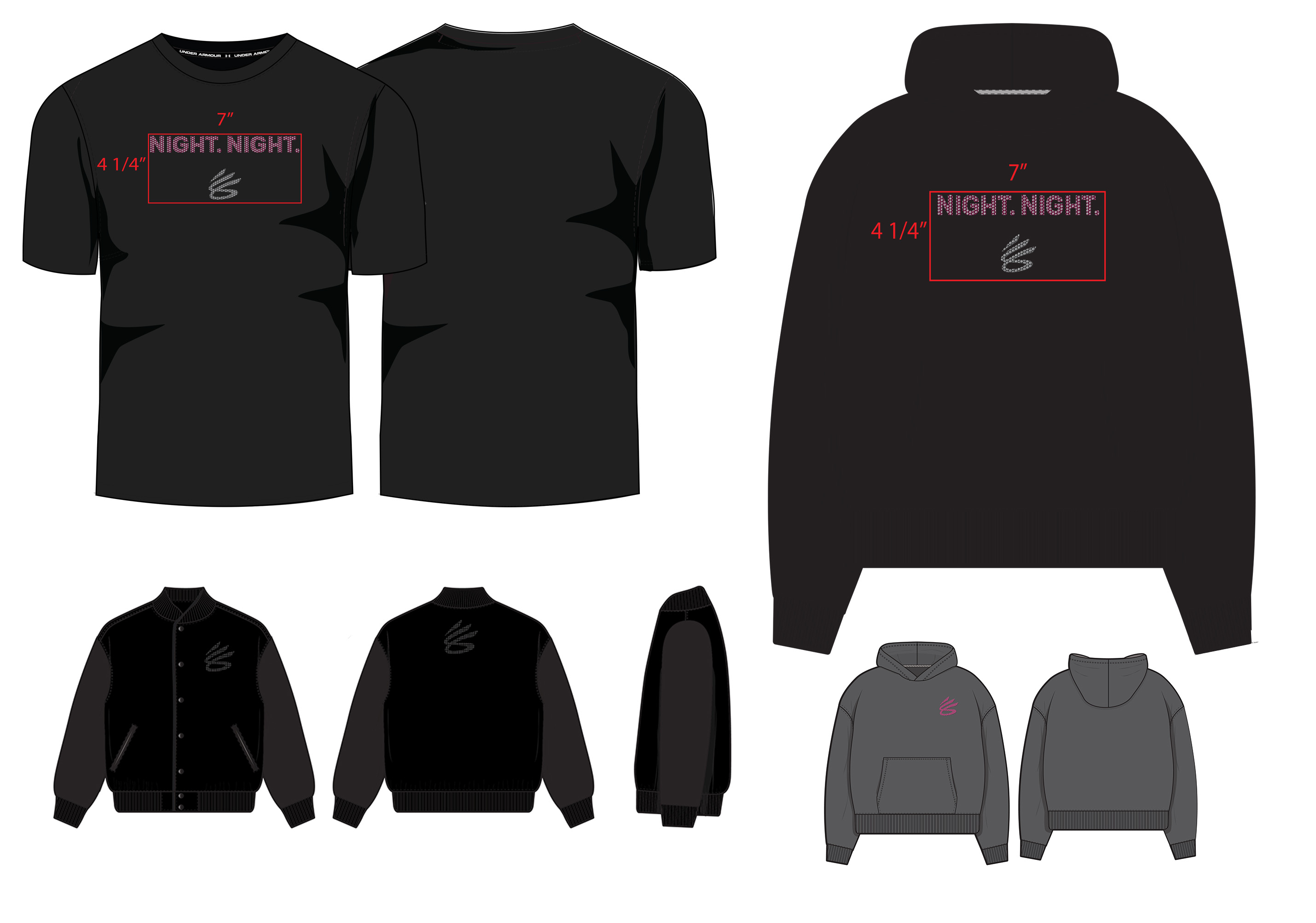
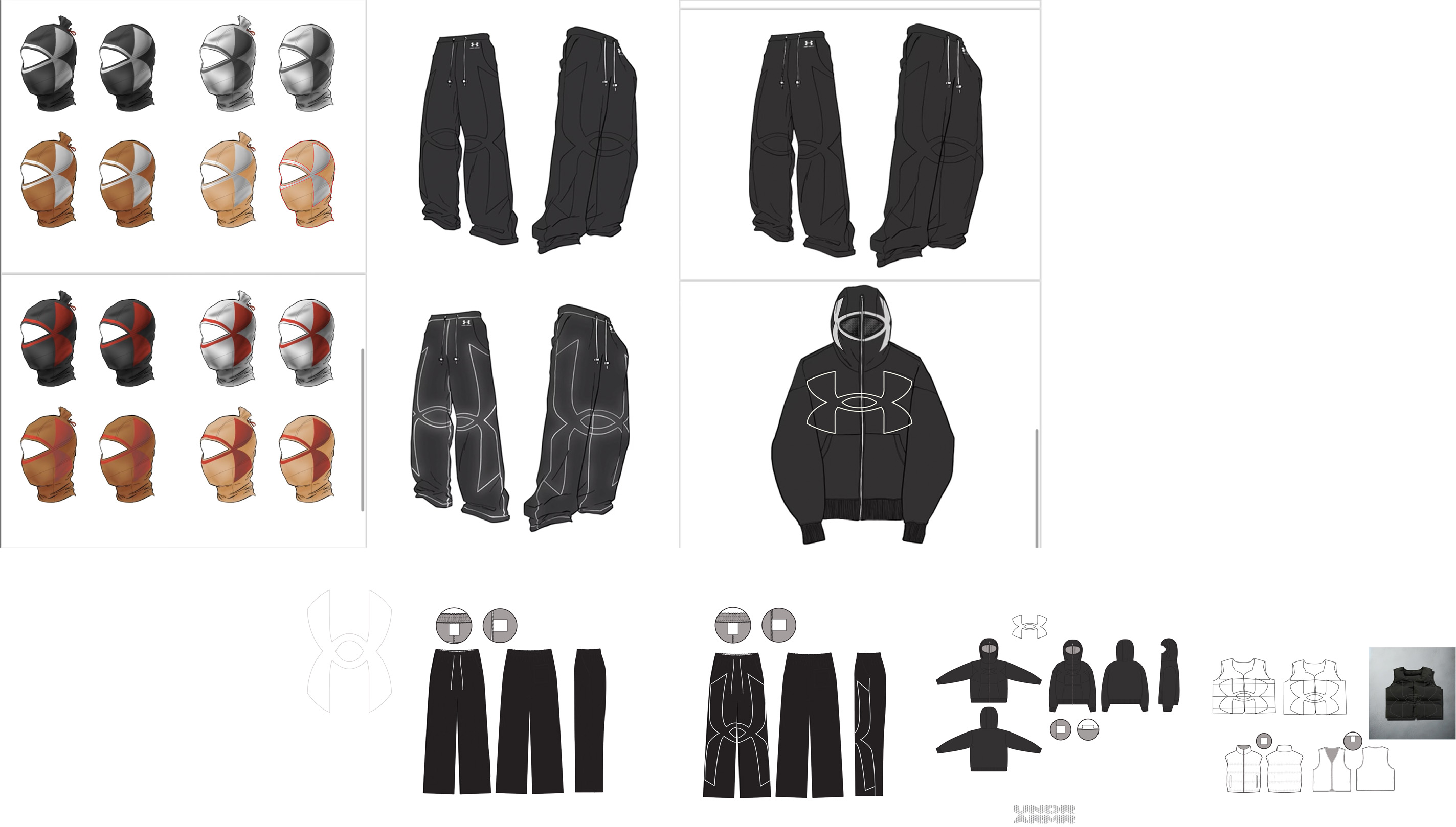
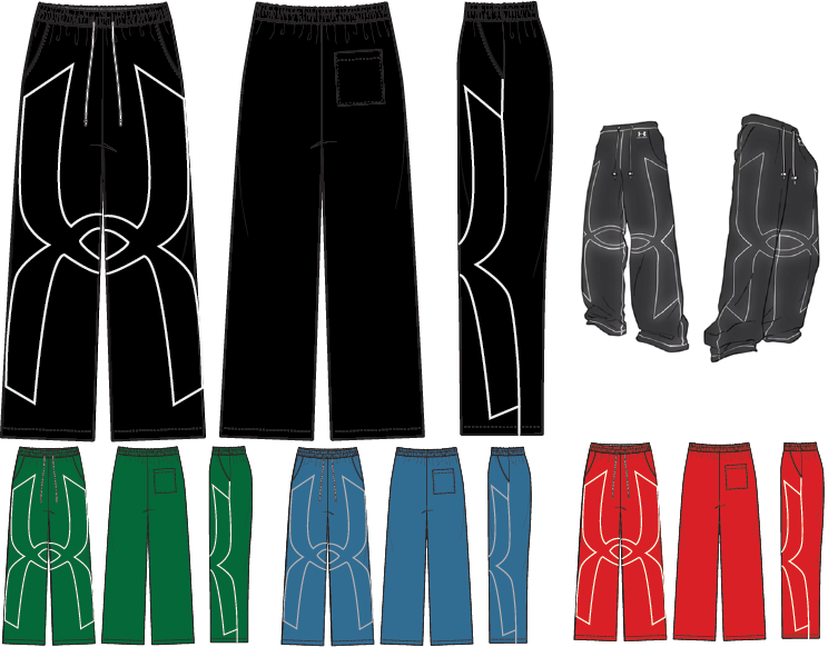
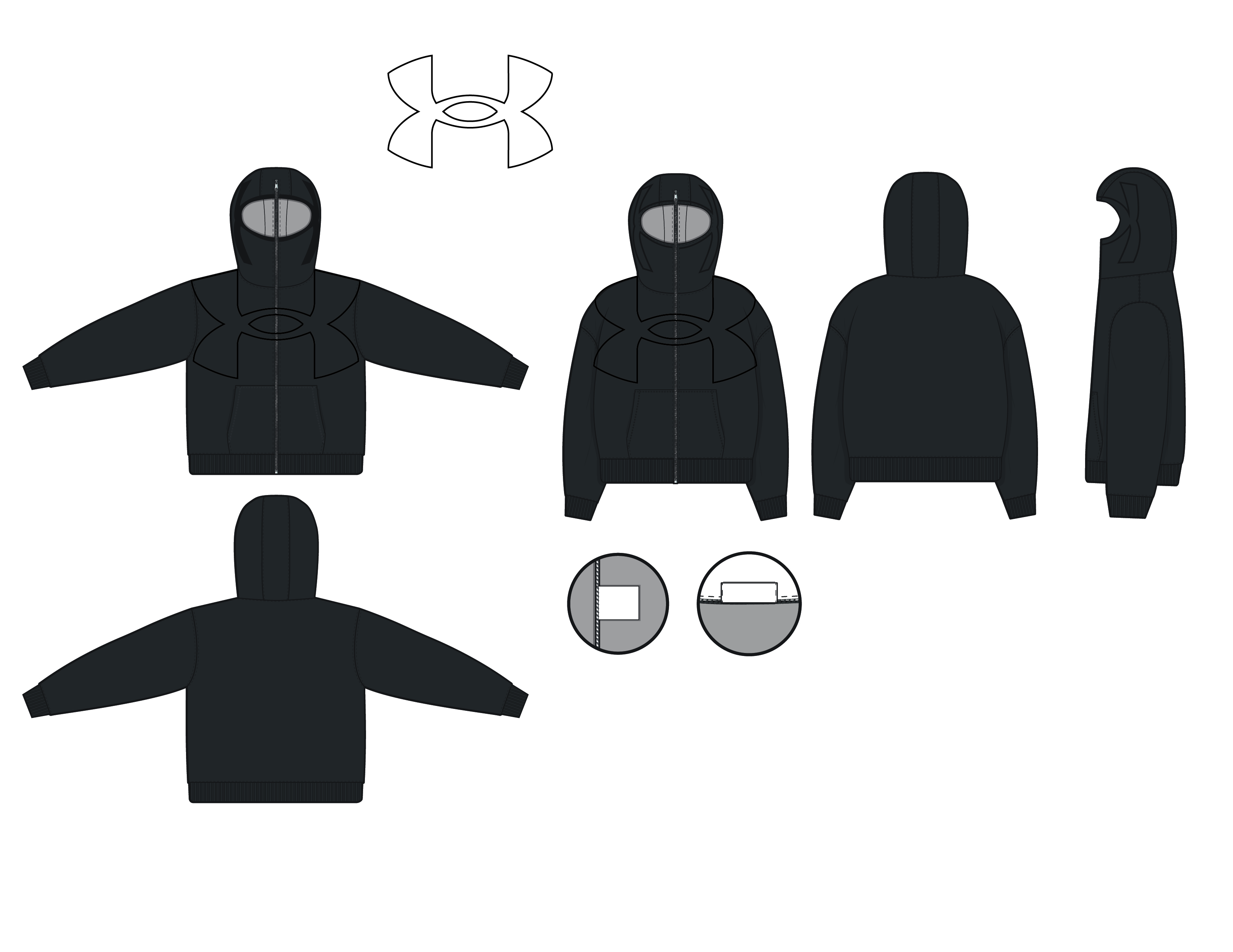
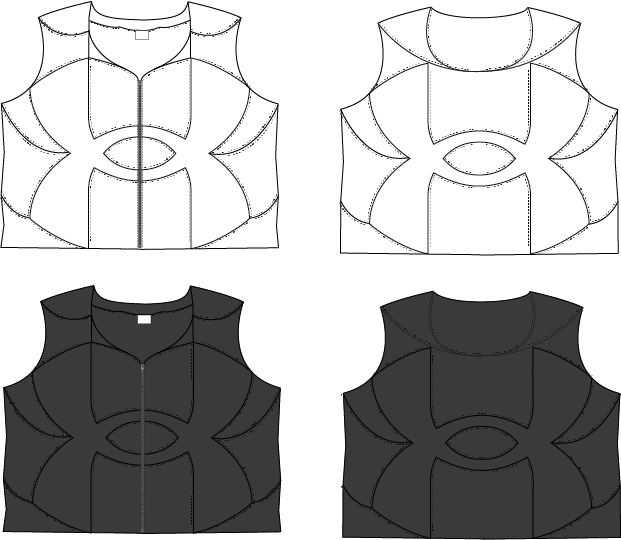
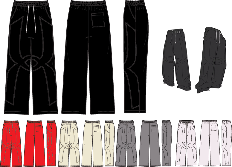
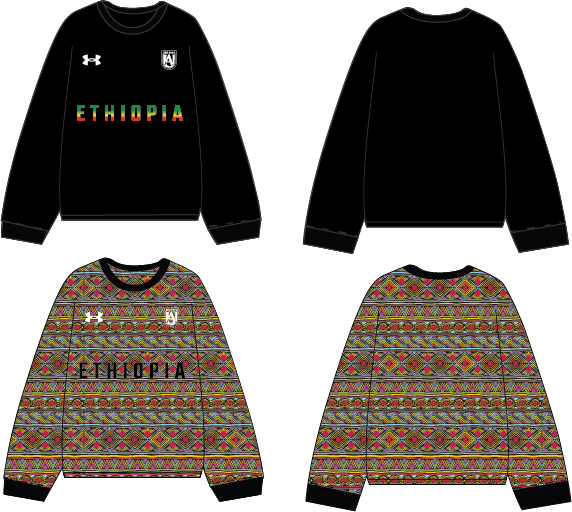
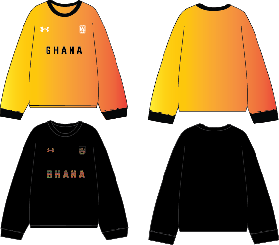
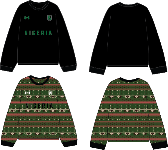
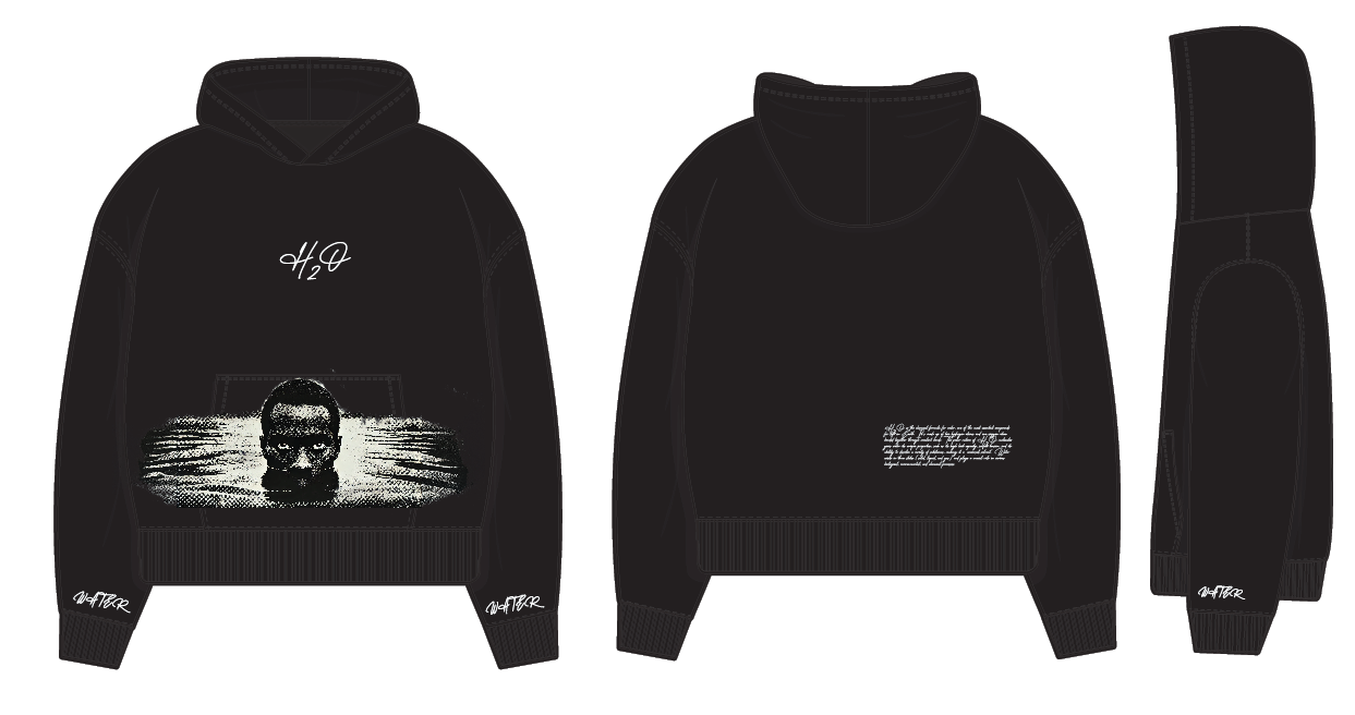
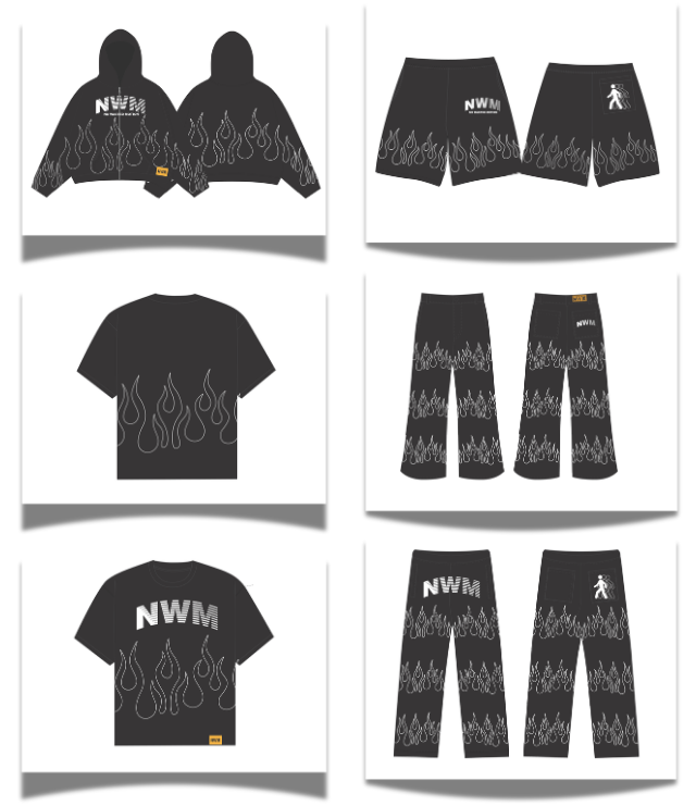
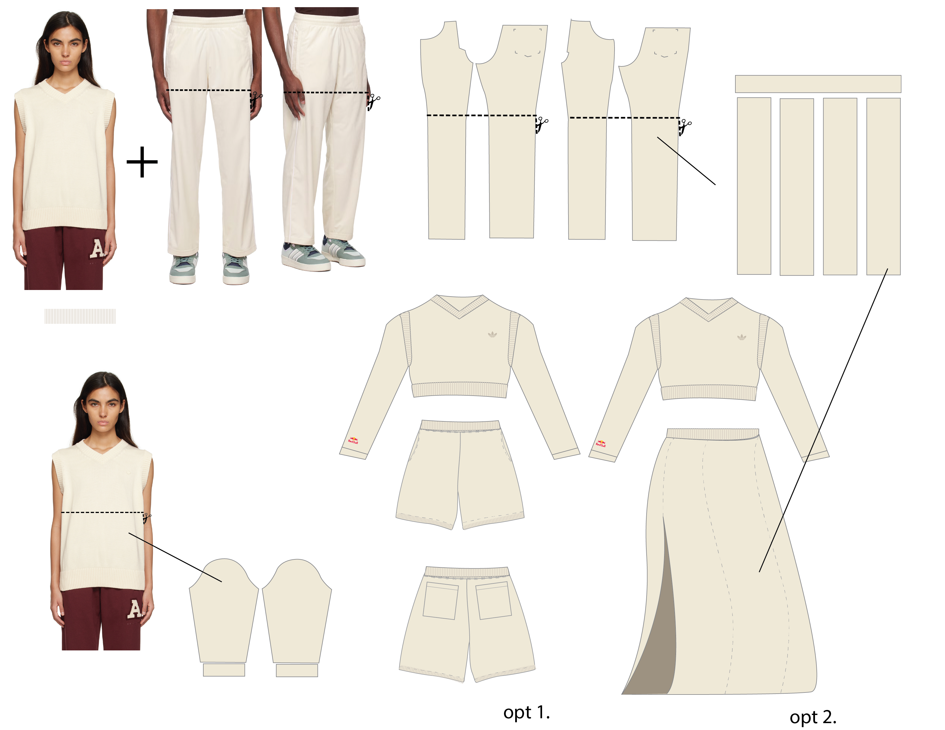
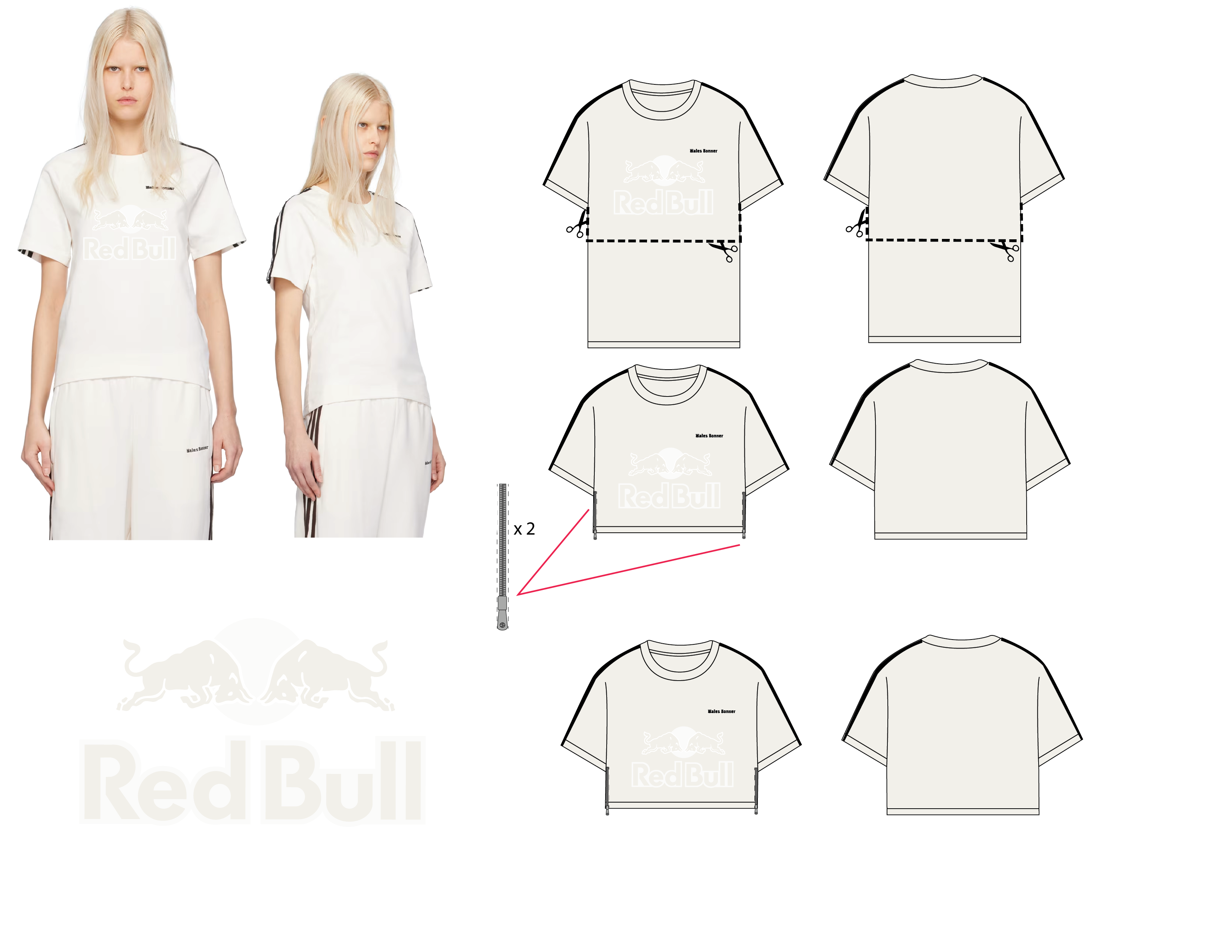
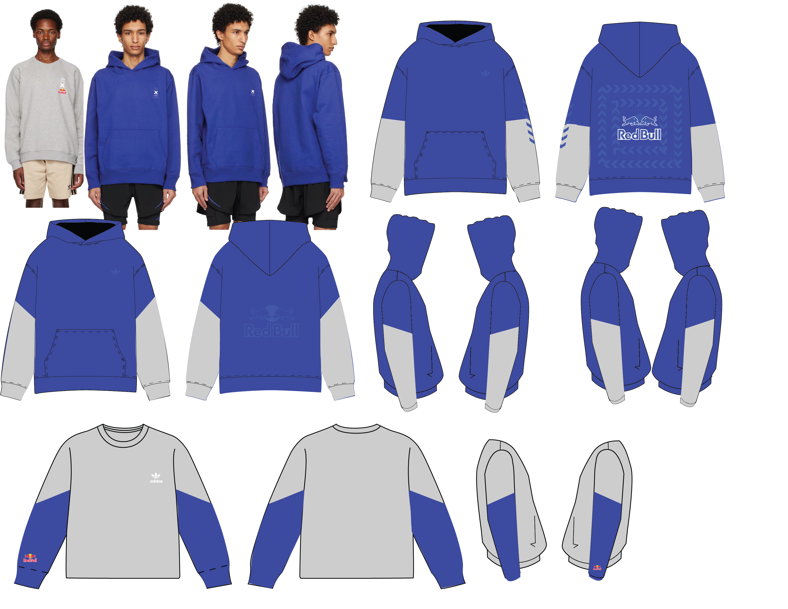
Product Design
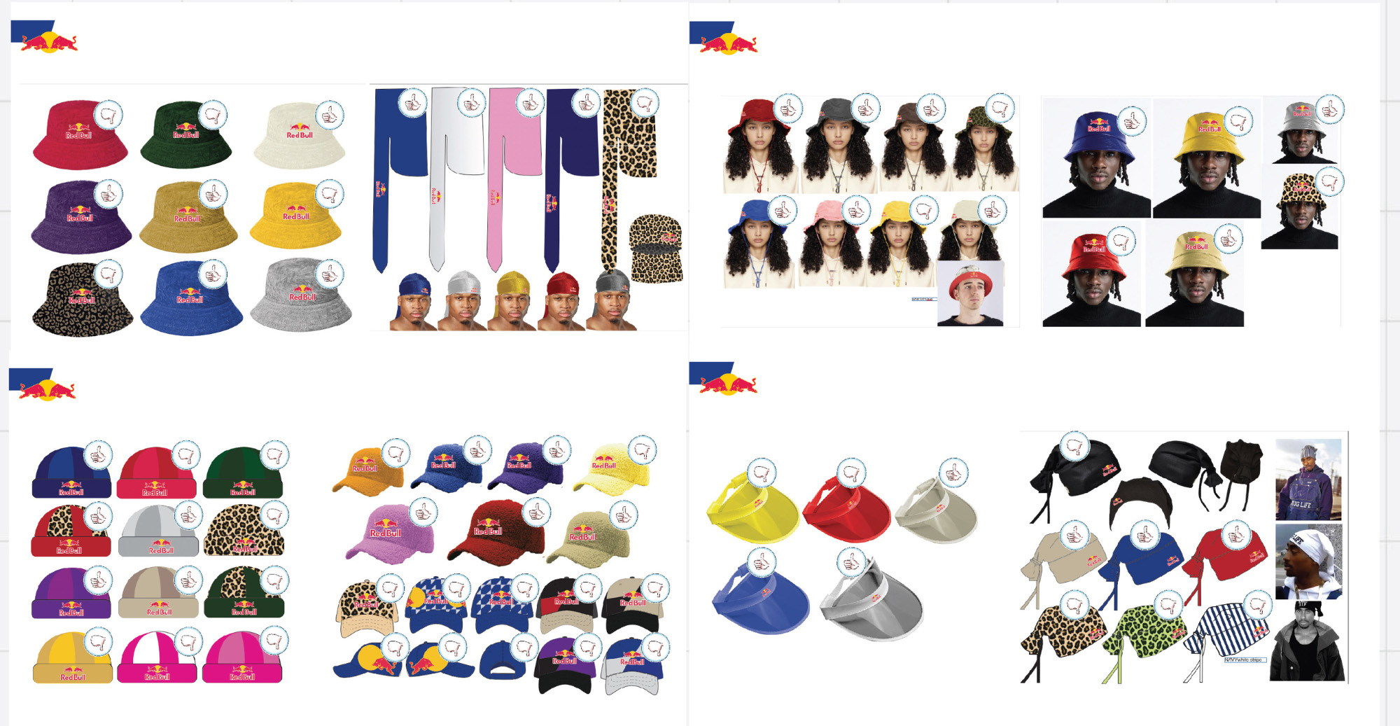
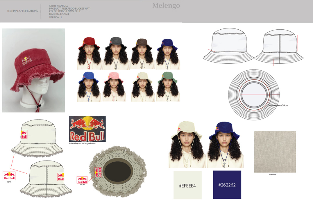


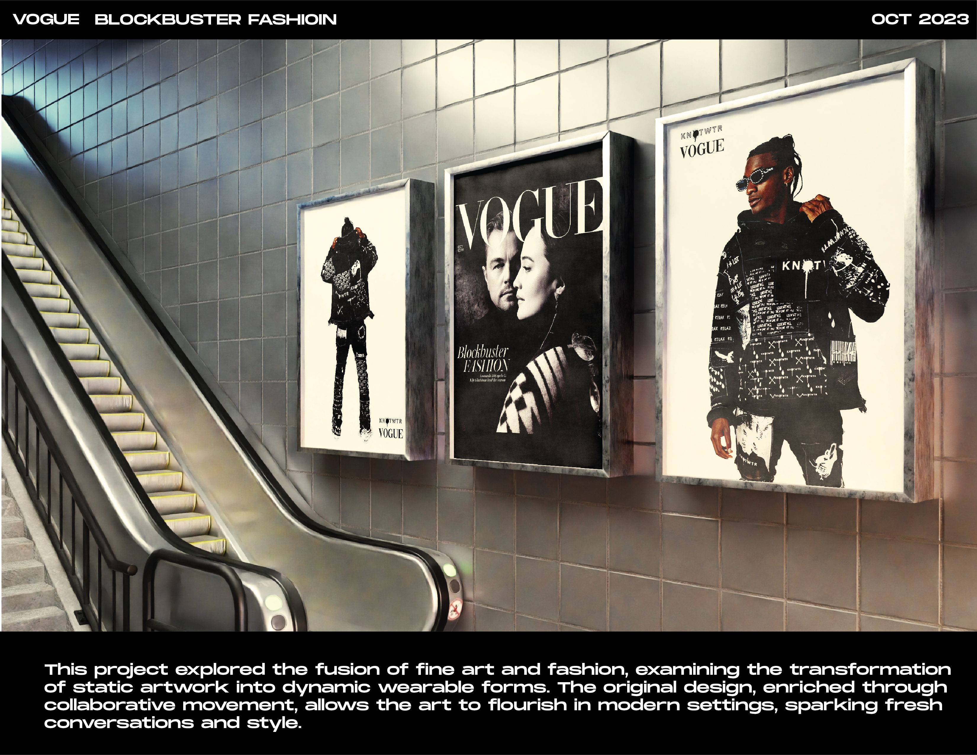
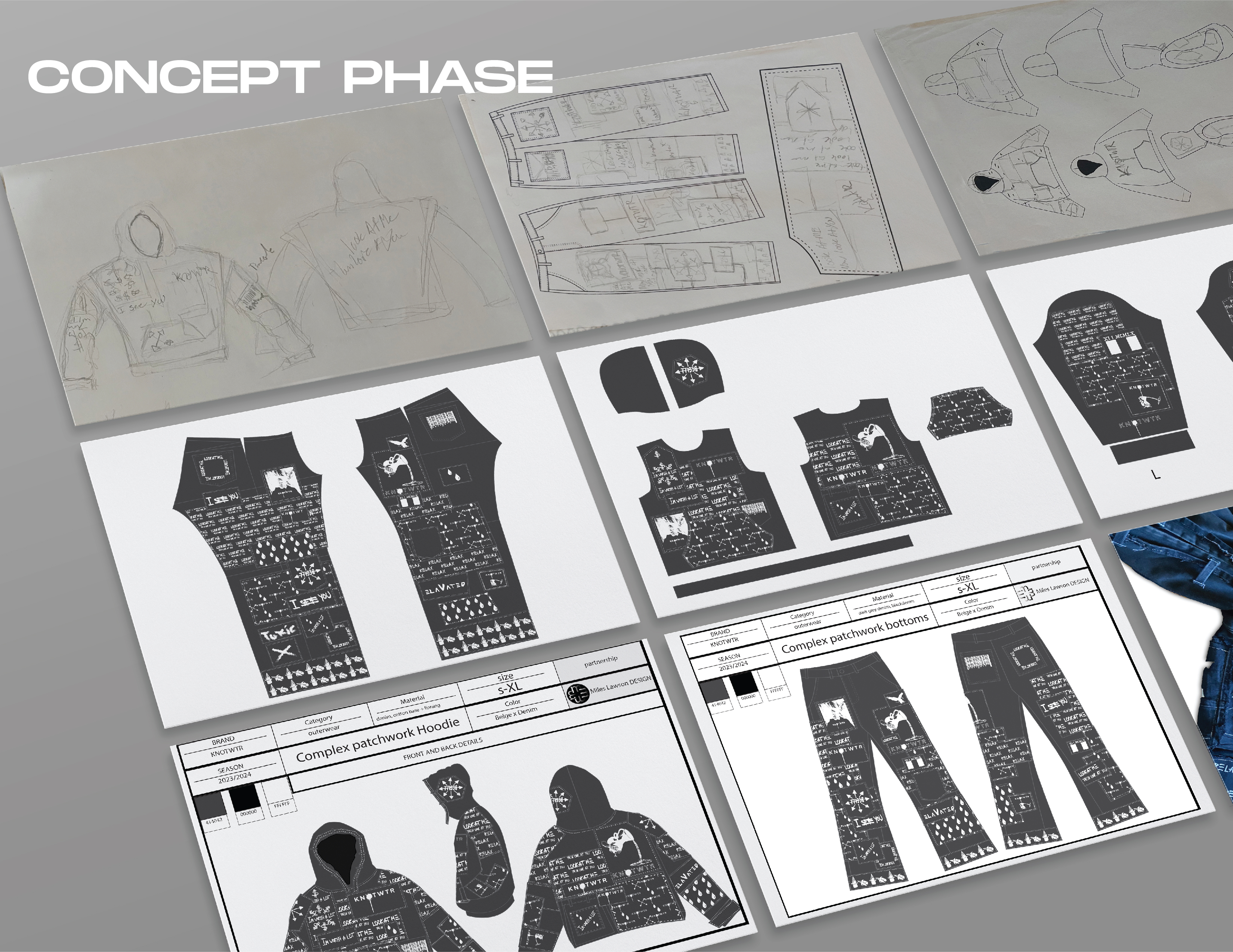
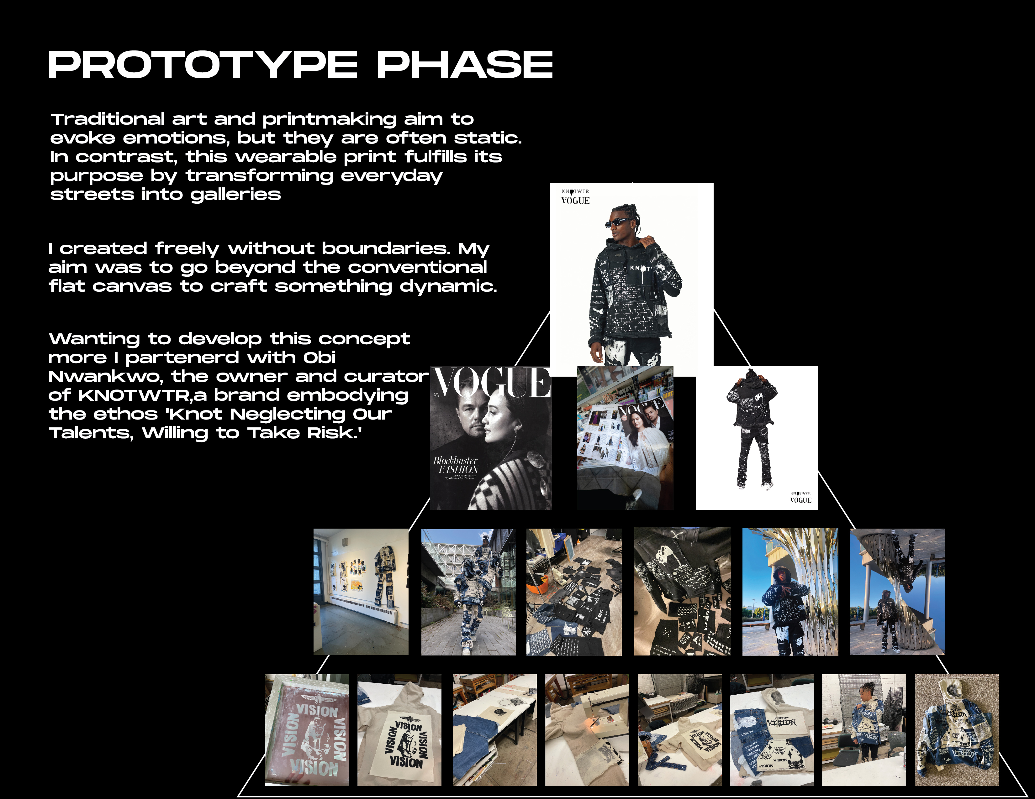
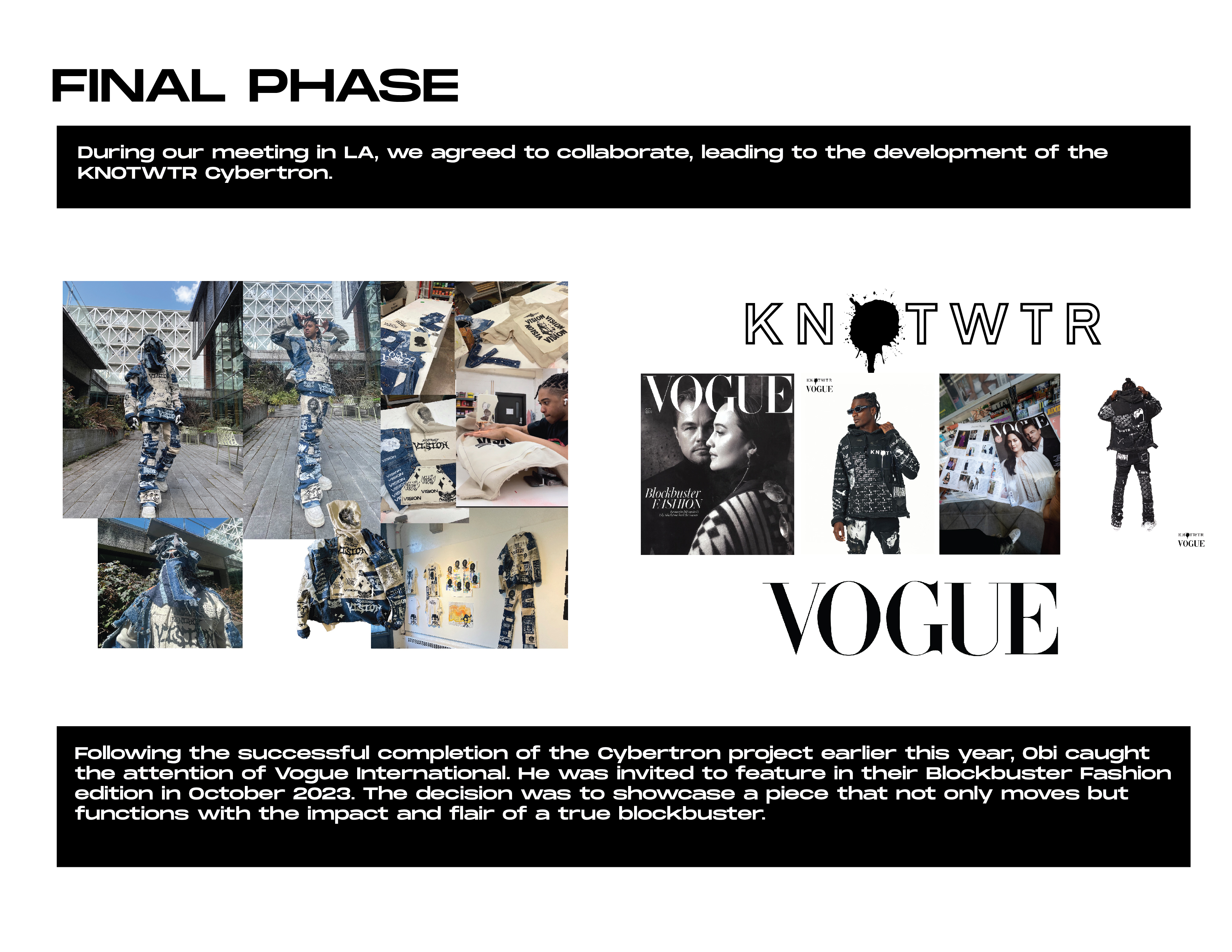
Red Bull.
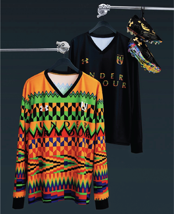
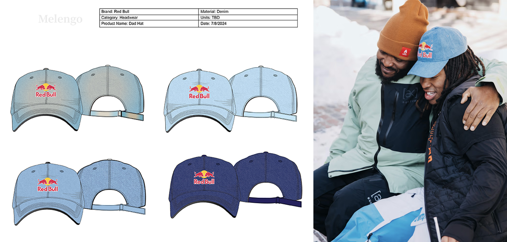
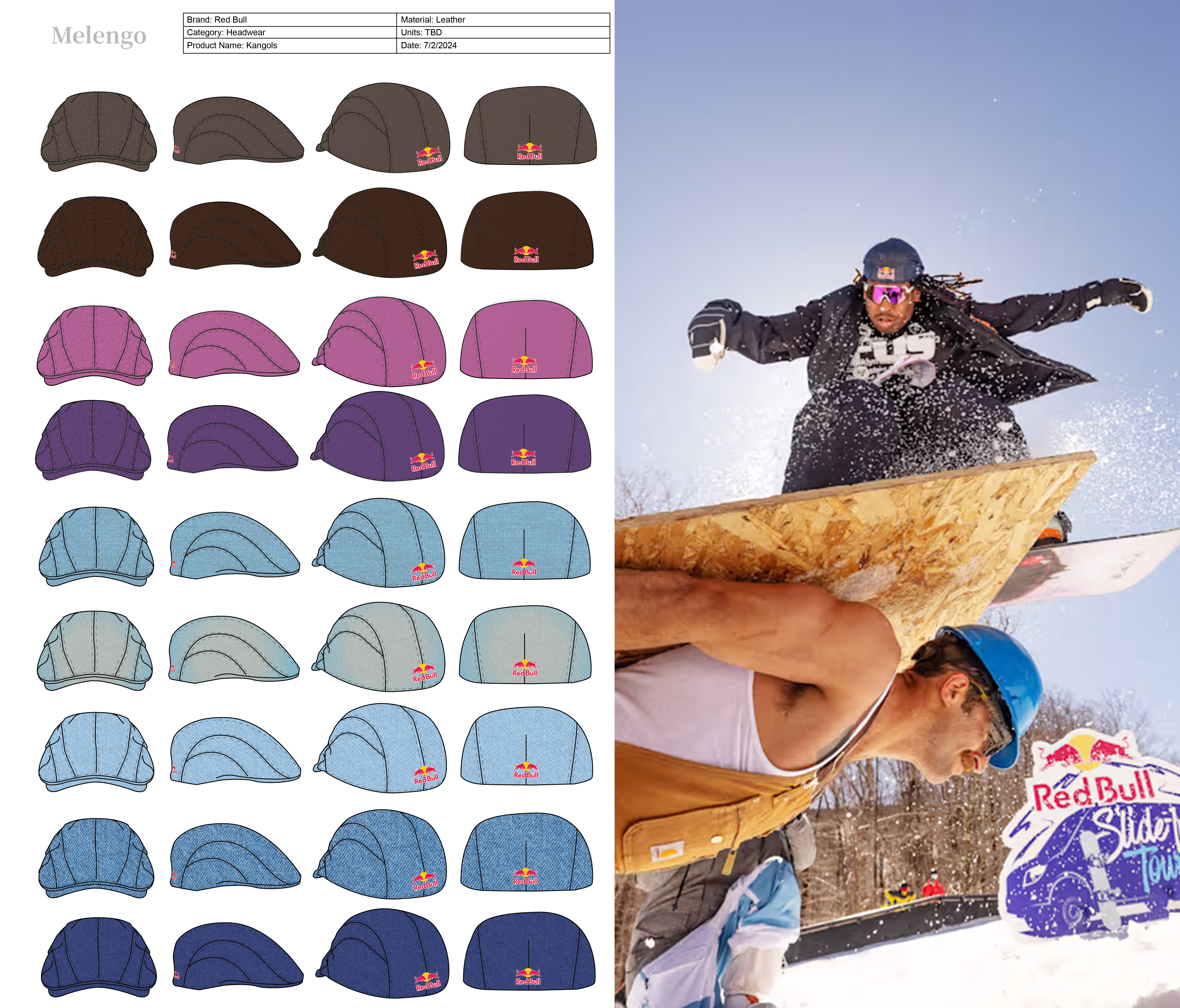
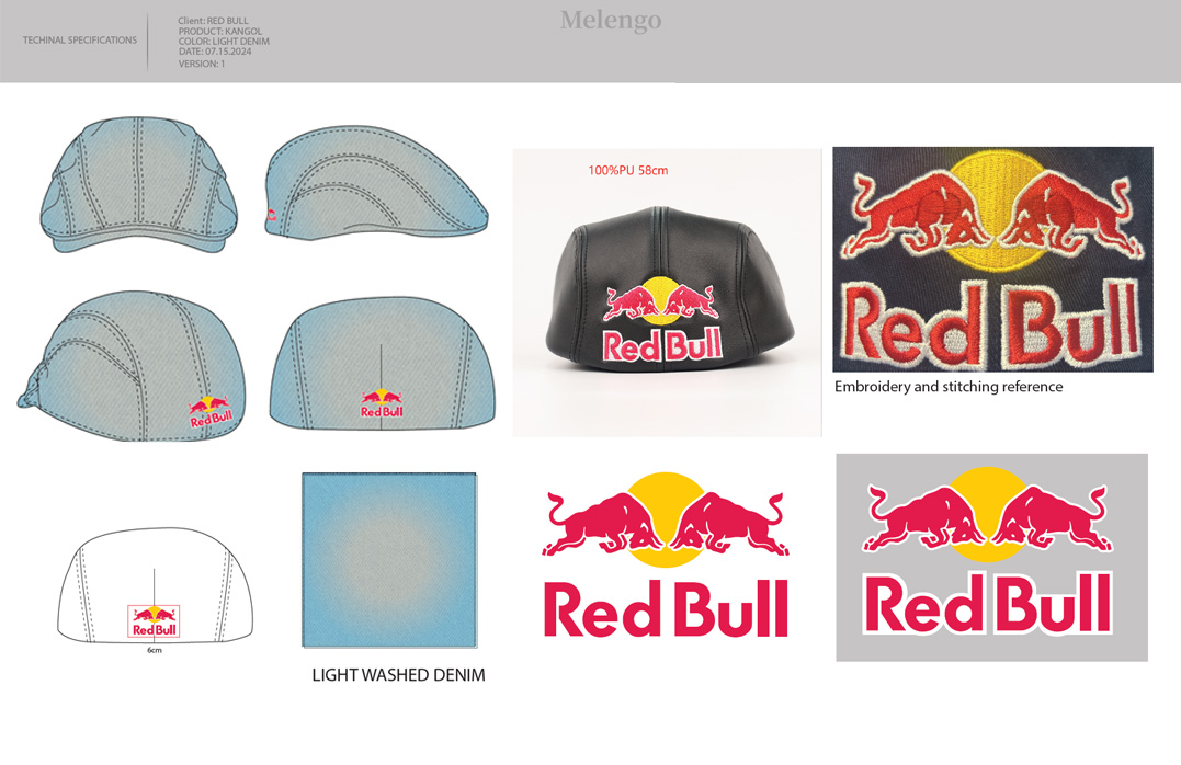
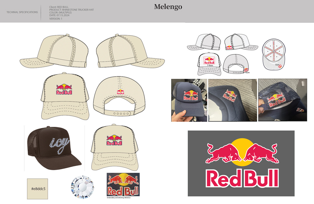
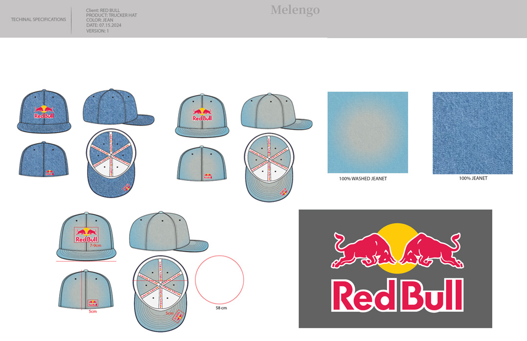
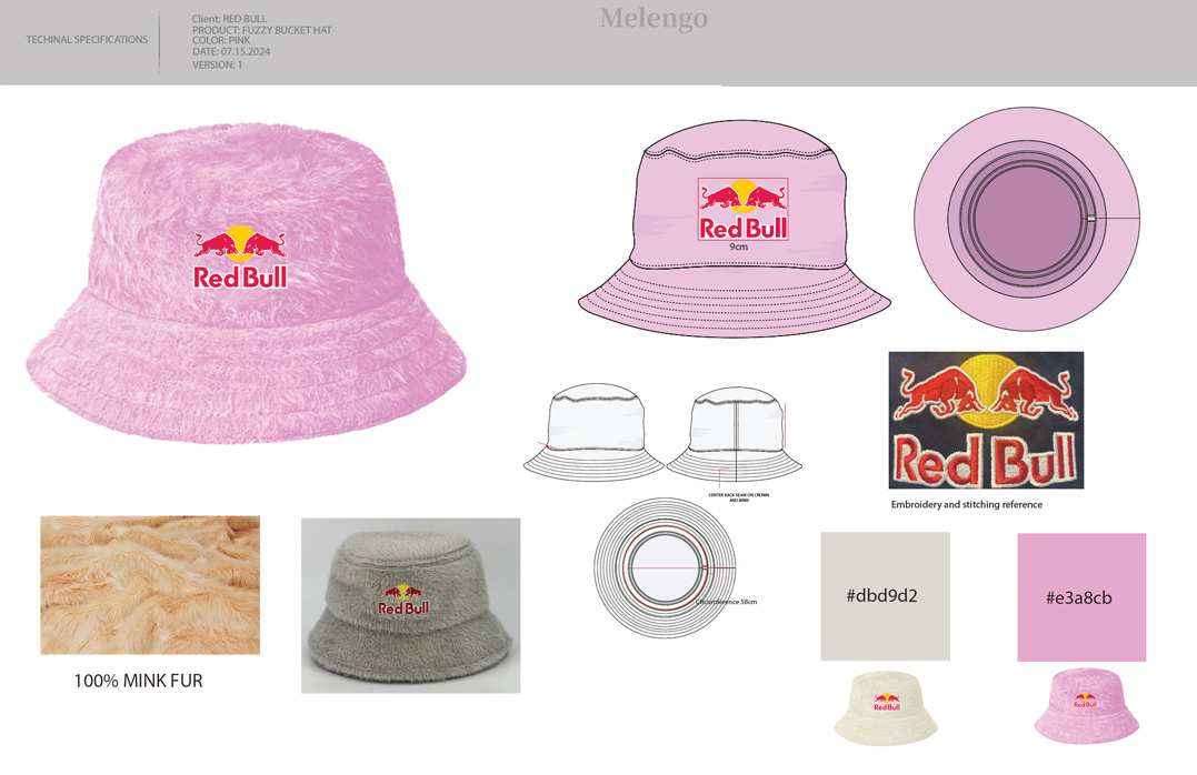
Tasked with developing headwear and custom product options for Red Bull athletes, including headwear development for Zebb Powell and exploring the full product range for B-to-C opportunities. For Trinity Rodman, we designed custom adidas × Red Bull items spanning apparel and accessories, directing creative from concept through final production-ready deliverables.
ClientRed Bull
ScopeCreative Direction, Tech Packs, Product Design
AthletesZebb Powell, Trinity Rodman
Year2023–2024